I was invited to shoot the opening night of a local San Diego theatrical play. The theater hosted a “Director’s Circle” reception before the performance in honor of the supporters and contributors. I was told that the event would be held in Craftsman Furniture store.
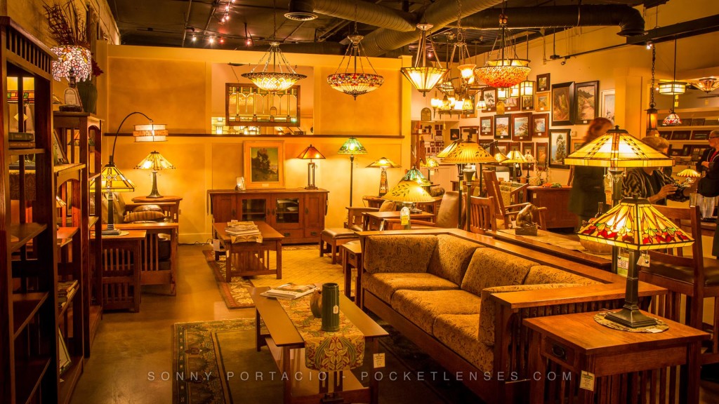
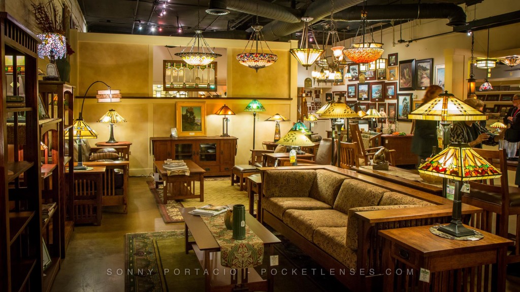
To prepare, I went to the store and met someone from the theater to get an idea of expectations for the reception (and I’m glad that I did). The first thing I realized was that the store was lavishly lit with craftsman style fixtures that gave off a nice warm incandescent glow. As inviting as the lights were, I knew that the photos would show this as orange tinted light. However, even with the abundance of orange tinted lights, I would still need to use a strobe. This complicates things. Typically a strobe is “cooler” (bluer) than the incandescent lights: if I white-balanced for the lights the people would look blue, if I white-balance for the people the store would look VERY orange. The other challenge was to avoid the typical “bright strobe, deer in the headlights, harsh shadows” look of a bare on camera flash. What to do?
Here are some tips if you happen to find yourself in a similar situation.
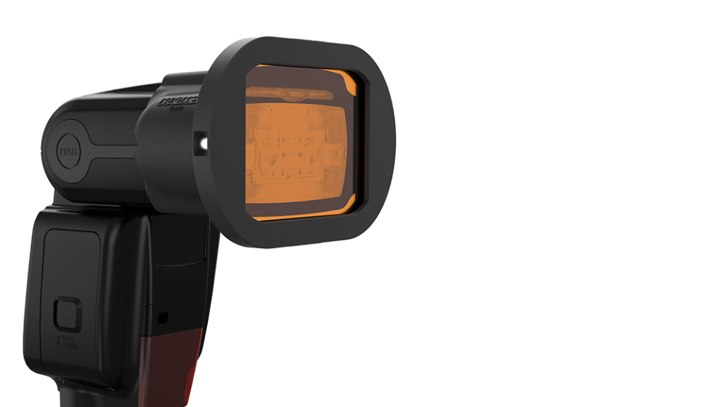
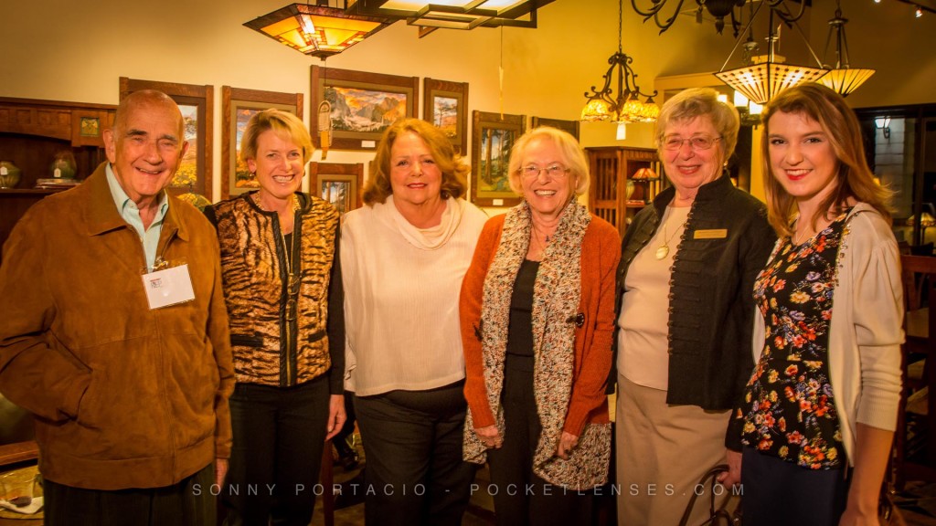
I took some establishing shots of the light fixtures before the guests arrived. I white-balanced the light to my taste. I could’ve balance the light to make it technically “correct”, but I didn’t like the outcome. The style of lighting and furniture really benefitted from a slightly warm glow, so I tweaked the balance just a bit to retain some of the intended warm ambiance. I then shot a few test shots with the strobe and, as expected, things lit by the strobe appeared bluish in comparison to the background. To fix this I put a warming gel (an orange tinted filter) on my strobe. This did the trick. Orange tinted light in the background, orange tinted strobe, white-balance the whole lot and everything looks normal. I then placed the strobe in a 24″ portable soft-box that I had a friend port around (This was no easy task, he had to avoid bonking either people or furniture in a rather confined space! Bonking either of which could prove disastrous.).
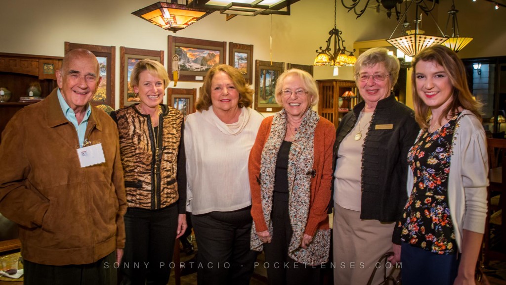
The overall result was perfect! Properly balanced light from a soft-box took the harsh edge off shadows AND allowed us to angle the light that was more natural. People retained their skin tones balanced with a slightly (but not overly) warm background light. Very complimentary portrait lighting!


Sonny. Listen to your podcast on white balance and read the same article. Very helpful. Great job
Thanks Bill! Hope it helped out with white balance.
This information about lighting is really interesting. Being able to adjust to make up for things is going to help a lot.
Hope I was able to help out with White Balance Phil!