For fun:
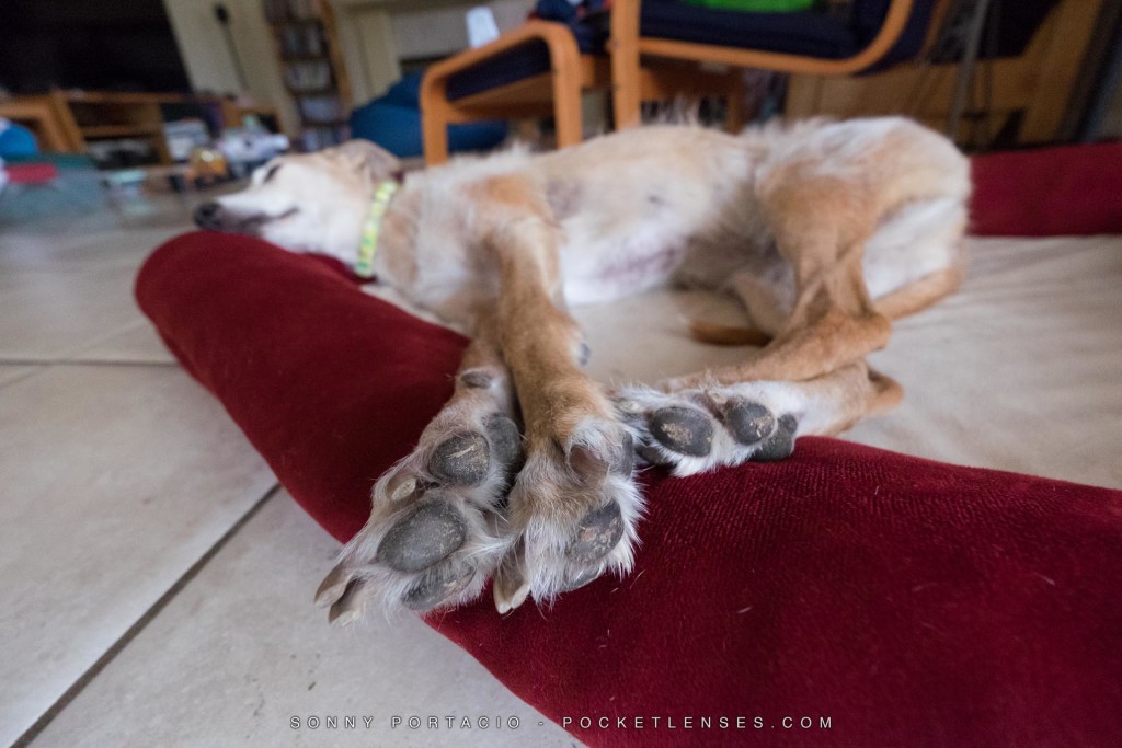
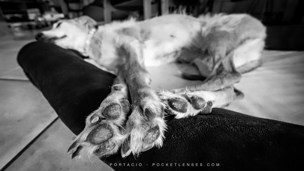
Directly below is an untouched original photo that I shot this morning for my photo for the day. It’s my selection for my “Project 365 / 366” where I take (several) photos EVERY day and post one. Below that, is a Black and White final image that I posted and shared.
Take a look at both images (click on them for a larger view) and challenge yourself to answer …
1) Why do you think I composed the shot the way I did?
2) Describe what edits and changes do you think I made?
3) WHY do you think I made those editing decisions and choices?
Leave a COMMENT BELOW and / or leave a comment on this facebook post.
On a future post, I’ll clearly write out and explain why I shot the way that I did and go over the changes I intentionally made AND (most importantly) WHY.
Here are the 2 images: Let me hear from you. Enjoy!
Click this link to view my video “walkthrough” of my process for this photo


If this is your FIRST time leaving a comment, the website may not post it right away. Once you’ve left at least one comment on this website, all of your future comments will be posted immediately. Cheers!
I think you composed the shot this way to define, focus on, the dog’s feet, causing the remainder to fade out of focus. You then cropped it to remove distracting background & converted it to B&W to further define the feet. You may have sharpened the feet, and heightened the contrast over all.
A great photo!
Hey Marilyn! Nice deduction there. I’ll be posting my disclosure on this photo and discussing it on a podcast soon.
I think the biggest change (beyond the obvious shift in pallet and crop) is the burning out of the detail in the upper right corner, removing some of the things that would have pulled focus from the subject.
It looks like you heightened the over all contrast but I think you might have specifically hit the contrast on the nap of the fabric right of the paws (or maybe sharpened that area?) I don’t think there’s enough contrast in the color image to make those ridges pop like that and it’s a great detail.
Hey Cully! Great eye for detail. I’ll be posting my disclosure on this photo and discussing it on a podcast soon.
Your composition makes the dog’s paws the subject of the picture. If this was a poem, I think it would speak to me about what the dog’s dream. Like boots with holes, these paws leave no doubt that they belong to a hardworking dog who deserves to rest and to gain the energy for more running and hard work the next day. You removed the elements which were basically not needed – chair, bookshelf, a few pieces of hair. You also removed the colors, because your picture is not a prose but a poem – forcing the reader to use his own imagination as well as feelings. This way every person who “reads” your picture, gets something unique from it.
Hey Greg! Love the poetry connection. Thanks! I’ll be posting my disclosure on this photo and discussing it on a podcast soon.
1) My guess is the idea for the shot was to bring the eye immediately to the dog paws, which I always find to be kind of a cool subject. You are then led into the out of focus sleeping dog by the long front legs.
2) & 3) Cropping the top, left and bottom brings more emphasis to the subject and helps eliminate a good portion of the background clutter. It looks like you sharpened slightly judging from the detail in the fabric and the fur of the paws. You pulled the shadows or the exposure down (or a combination of both) to add to the emphasis of the paws and darken the distractions out of the background even further. Then a slight bump in contrast to bring more definition in the fur of the paws and darken things a bit more. Possibly some post crop vignetting to bring the viewer to the main subject.
Of course…IMO
Hey Mark! Great perception and thoughts on the picture. I’ll be posting my disclosure on this photo and discussing it on a podcast soon.